


Blog
Access industry insights that will take your organization—and your people—to the next level.

Featured resources:
New OSHA Recordkeeping Requirements in 2024
Aug 10, 2023 7 min read
Got a Few Minutes? Keep Crew Skills Sharp with Microlearning
Apr 09, 2026 3 min read
Education vs. Training: Knowing the Difference, and How to Use Them
Jan 09, 2026 3 min read
Five Strategies to Transform Student Training Into Career and Lifelong Success
Apr 15, 2026 1 min read
Filter
Latest resources

Webinar Session Recap: Modern Police Deployments
April 21, 2026 1 min read

Real-Time Soldier Readiness Decision-Making: Insights from AUSA Global Force Symposium
April 17, 2026 1 min read

Mental Health Awareness Month 2026
April 17, 2026 1 min read
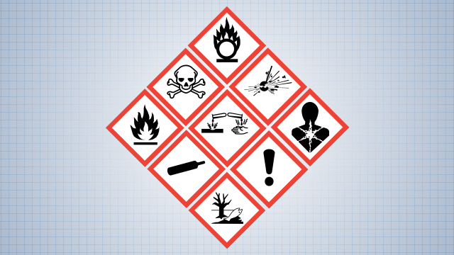
What Is HazCom? OSHA’s Standard Explained
April 16, 2026 5 min read

Safety Audit: How to Plan, Conduct, & Improve Your Program
April 15, 2026 5 min read

Five Strategies to Transform Student Training Into Career and Lifelong Success
April 15, 2026 1 min read

Strengthening Emergency Communications: A Conversation with Jason E. Kern
April 14, 2026 1 min read

New Enhancements to Vector’s Police Fleet and Equipment Management Software
April 14, 2026 1 min read

What Is EHS? Environment, Health, & Safety Explained
April 14, 2026 5 min read

Mental Health Awareness Month 2026
April 12, 2026 1 min read

Got a Few Minutes? Keep Crew Skills Sharp with Microlearning
April 9, 2026 3 min read

Now Available: Vector Solutions’ Complete Firefighter I/II Training Series Aligned to NFPA 1010
April 7, 2026 1 min read

Compassion Fatigue and What First Responder Organizations Can Do
April 7, 2026 1 min read

Positive Recognition in 911 Call Centers
April 2, 2026 1 min read

Casino AML Risk in 2026: Key Takeaways from the NMLRA
March 27, 2026 3 min read
Explore our software solutions designed to help your organization succeed
Request a Demo