


Blog
Access industry insights that will take your organization—and your people—to the next level.

Featured resources:
New OSHA Recordkeeping Requirements in 2024
Aug 10, 2023 7 min read
Got a Few Minutes? Keep Crew Skills Sharp with Microlearning
Apr 09, 2026 3 min read
Education vs. Training: Knowing the Difference, and How to Use Them
Jan 09, 2026 3 min read
Five Strategies to Transform Student Training Into Career and Lifelong Success
Apr 15, 2026 1 min read
Filter
Latest resources

Reducing Risk in Local Government: 10 Essential Training Courses for Safer Cities
April 30, 2026 4 min read

Connecting Early Intervention Flags with Officer Wellness and Retention
April 29, 2026 1 min read

Advancing Readiness Through Innovation: Matt Barnes Honored at FDIC 2026
April 29, 2026 2 min read

Nevada’s New AML Rules Put Independent Agent Training Front and Center
April 29, 2026 3 min read

Electronic Timecards Coming Soon: A Simpler Way to Manage Approvals
April 28, 2026 1 min read

Warehouse Safety: Hazards, Guidelines, & Best Practices
April 28, 2026 5 min read

What Is EHS Software? Features, Benefits, & How It Works
April 27, 2026 5 min read

Turning Insight into Impact: How Data Is Transforming College Campuses
April 27, 2026 1 min read

Webinar Session Recap: Modern Police Deployments
April 21, 2026 1 min read

Real-Time Soldier Readiness Decision-Making: Insights from AUSA Global Force Symposium
April 17, 2026 1 min read

Mental Health Awareness Month 2026
April 17, 2026 1 min read
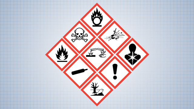
What Is HazCom? OSHA’s Standard Explained
April 16, 2026 5 min read

Safety Audit: How to Plan, Conduct, & Improve Your Program
April 15, 2026 5 min read

Five Strategies to Transform Student Training Into Career and Lifelong Success
April 15, 2026 1 min read

Strengthening Emergency Communications: A Conversation with Jason E. Kern
April 14, 2026 1 min read
Explore our software solutions designed to help your organization succeed
Request a Demo