Smart Ideas: E-Learning, Airline Boarding Passes, and User Experience Design

Resources

Training and Visual Design Image

Part of my job is to meet with customers who have recently adopted the Convergence learning management system (LMS) and want some face-to-face instruction on how to use it in the most efficient manner at their work place. As a result, I do a good deal of flying.

And while I’m flying, I’m often confused when scanning my boarding passes. It’s hard to find the information I’m looking for—what is my flight number, when does my plane leave, and what gate do I need to get to? You’d think finding that information would be simple enough, but it’s not.

Well, apparently I’m not the only one who gets confused by this. NPR’s All Tech Considered blog recently ran an article about British designer Pete Smart (good name for this guy) who felt the same way. Except, unlike me, Pete Smart did something about it. He created a new design for boarding passes that’s brilliant. It’s easy to read, the information is clearly displayed in logical places and in larger fonts, and it’s even oriented in the proper direction based on the assumption that you dual-purpose your boarding pass as a book mark. Again—brilliant! (Or maybe I should say “smart!”)

These are tips you can use when designing your own elearning courses and other training materials, and most of this falls under the category of visual hierarchy. We’ll share some of those tips in the article below, and we hope you find them helpful when you’re creating your own training materials.

Visual Design Tips For Airplane Tickets that You Can Apply to Training Material Design

Below is an image of Mr. Smart’s redesigned airline ticket (in color) and an example of a traditional, standard airline ticket (in black and white).

Quickly scan each ticket to see how much easier Smart’s ticket is to read, largely due to the wise application of visual and information design principles, including something called visual hierarchy.

^ Levels of Learning Pyramid

The boxes on the right-side of the image above call out some of the plusses and minuses of each ticket design, but let’s look at those a little closer:

Visual Hierarchy: Visual hierarchy is using visual design elements to present items in order of importance and order. Note the improved airline ticket has the flight and gate at the top, that it uses bigger font for the departing and arrival cities, that it uses different background colors to differentiate different sections, and that the sections are presented in a logical, sequential order from top to bottom. It’s easy to imagine using these elements of screen layout, font size, and background colors to make it easier for learners to quickly scan your visual training materials and know what’s most important and what they should look at first. Click here to read more about visual hierarchy.

Vertical/horizontal layout: The improved airline ticket presents the information in a vertical, top-to-bottom fashion. This matches how people are used to seeing information presented in a book and it provides more space to guide the customer’s eyes through all the important information in sequence. You can imagine this doing in your training materials too, with the title of the screen appearing near the top, etc.

Contrast: In simple terms, contrast means something like things that look different from one another. Notice how the revised airline ticket uses white, black, and colors to make it easy to locate, identify, read, and understand the important information on the ticket. Now compare that to the gray and black color-scheme of the older ticket and see how hard that is to read. In a similar fashion, you can use contrast to make it easier for learners to understand the important information in your own visual training materials. Click here to read more about contrast.

Ease/Difficulty of reading: For all of the reasons listed above, plus more (for example, the clever use of visual icons in the revised airline ticket), Mr. Smart’s improved airline ticket is easier to read, and the older ticket is harder to read. Obviously, as a training materials developer, you want to make your training materials easier to read. Although this next resource is moving from “reading” visually to “reading” text, you may find this article on how to write training materials and this article on how to format written training materials interesting in this context as well.

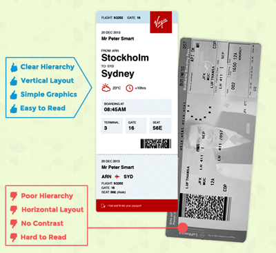
Applying Visual Design to Training Material Design

But what does all this have to do with workforce training, you ask? Well, if you’re creating your own e-learning courses, you can apply the same lessons to make the experience better for your learners.

To help you along these lines, we have two related articles full of visual design tips you can apply to your training materials:

And for those of you who would like to think about these ideas even more, you could certainly do worse than read one of the all-time classics of usability design, Steve Krug’s book Don’t Make Me Think.

Here are some more good books and articles to get you thinking:

Final note: This is part of an occasional series of somewhat-random posts I write when something in my daily life has cross-over appeal to my work world. For other posts in this series, check out this one on the use of humor in mandatory pre-flight safety presentations and this one that explains why wine “cries” in a glass.

Creating Learning Objectives Btn

How to Write Learning Objectives

All the basics about writing learning objectives for training materials.

Download Free Guide

Creating Learning Objectives Btn

Want to Know More?

Reach out and a Vector Solutions representative will respond back to help answer any questions you might have.